Every agency looks alike
Stock photos, long service lists and a form at the bottom. Nothing told a landlord why this team was different.
Property tech · London
Arlowe Baxter runs short-let management for London landlords. We redesigned the website in Figma and rebuilt it in Webflow in under a month, turning a service people need to trust with their home into a site that feels calm, premium and easy to say yes to.
The challenge
Landlords choosing a short-let manager are handing a stranger their property, their guests and their income. Most agency sites in this space look the same: stock photos, long lists of services and a contact form at the very bottom.
Arlowe Baxter needed a site that earns trust in seconds, shows the money before the small print, and gets a landlord to the first step, a free income estimate, before anyone picks up the phone.
Stock photos, long service lists and a form at the bottom. Nothing told a landlord why this team was different.
Landlords care about income first, but the numbers sat deep in the page or behind a call.
The first real action was at the very end. Most visitors never got that far.
How we worked
A tight timeline meant clear steps and quick decisions. Each stage ended with something the client could review and approve.
Discovery
We mapped what owners fear when handing over a home, and how London short-let competitors present themselves.
Structure
We moved the income estimate to the first screen and ordered every section as an answer to a landlord question.
Design
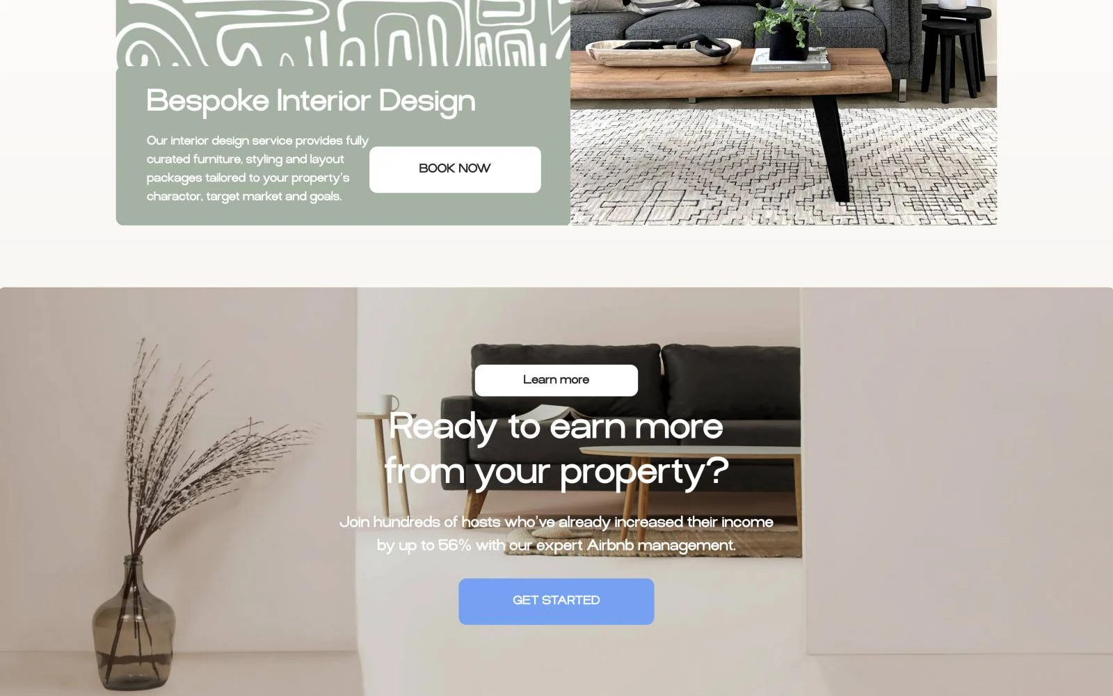
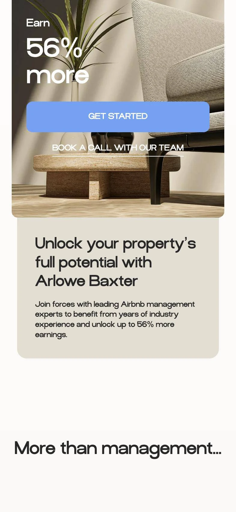
Stone and sage tones, generous photography and a friendly typeface, designed for desktop and mobile in Figma.
Build
Rebuilt in Webflow with the estimate form, reusable components and a branded loader, then tested on real phones.
The proof we put up front
The idea
Every section answers one landlord question: how much more will I earn, who looks after my guests, and how do I keep an eye on it. The service list comes after the reason to care.
Hero
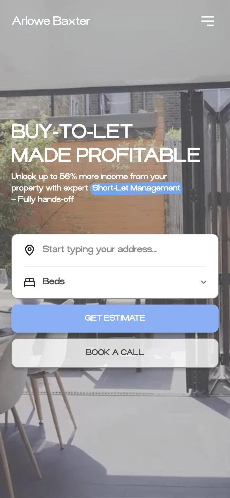
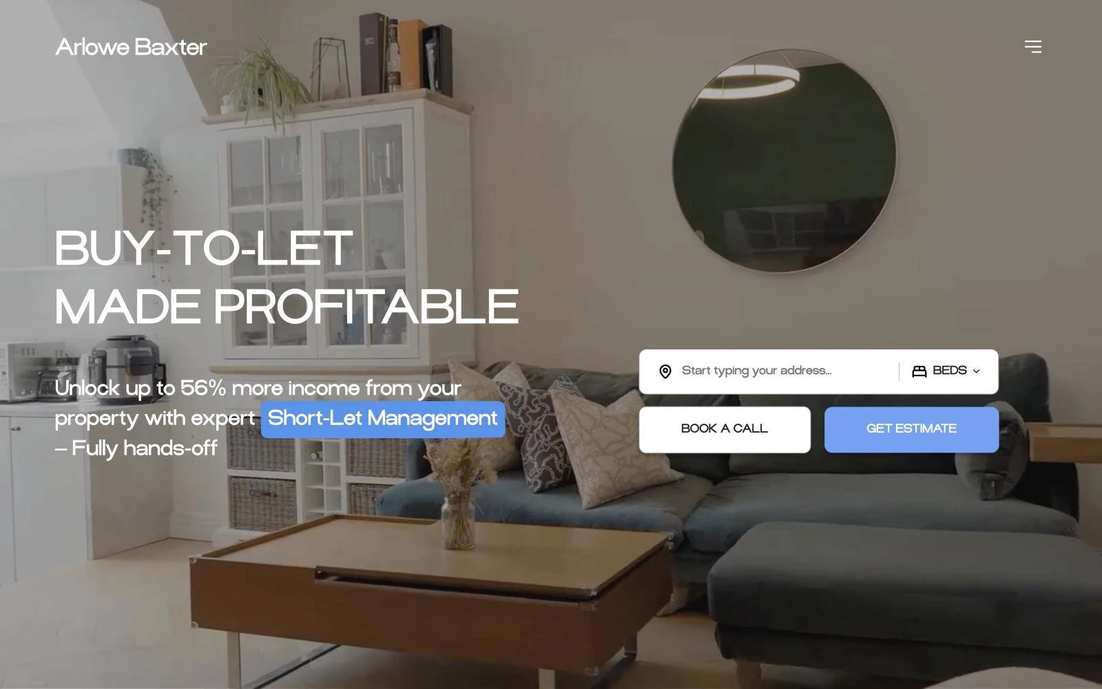
A bright, lived-in home on video, one bold promise and an address-plus-bedrooms form right in the hero. The landlord's first click is the start of a lead, not a scroll to the footer.
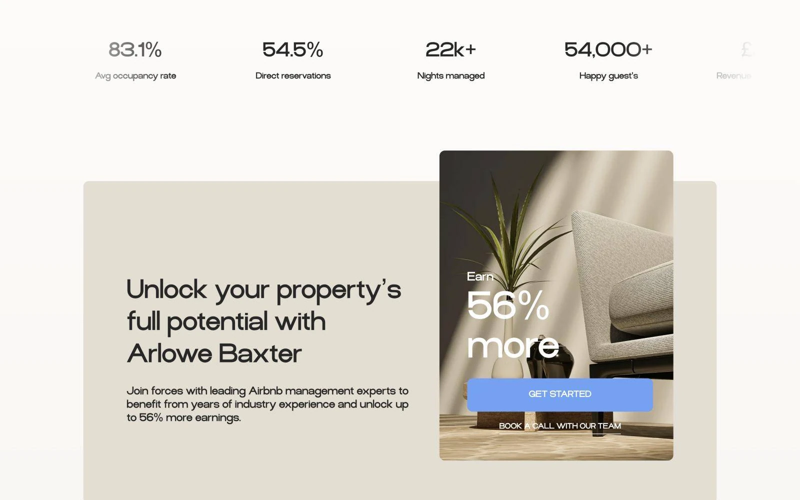
Services
Listing optimisation, guest experience and property care grouped into three clear blocks, with the performance-based fee shown openly beside them. No hunting for the price.
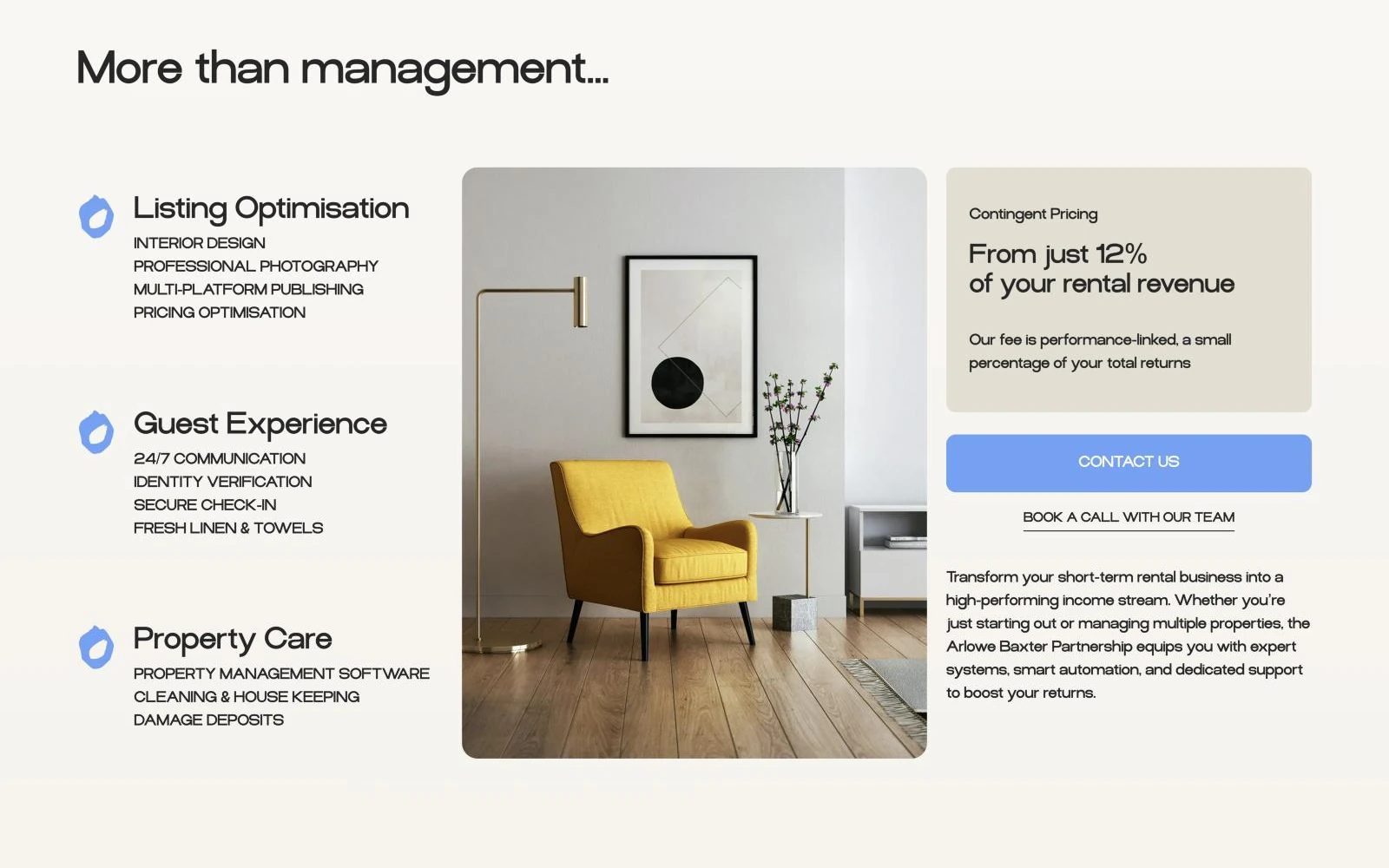
Transparency
Owners worry about losing sight of their property. The site shows the owner app in context, with occupancy, cleaning, maintenance, reviews and earnings named as chips you can scan in a glance.
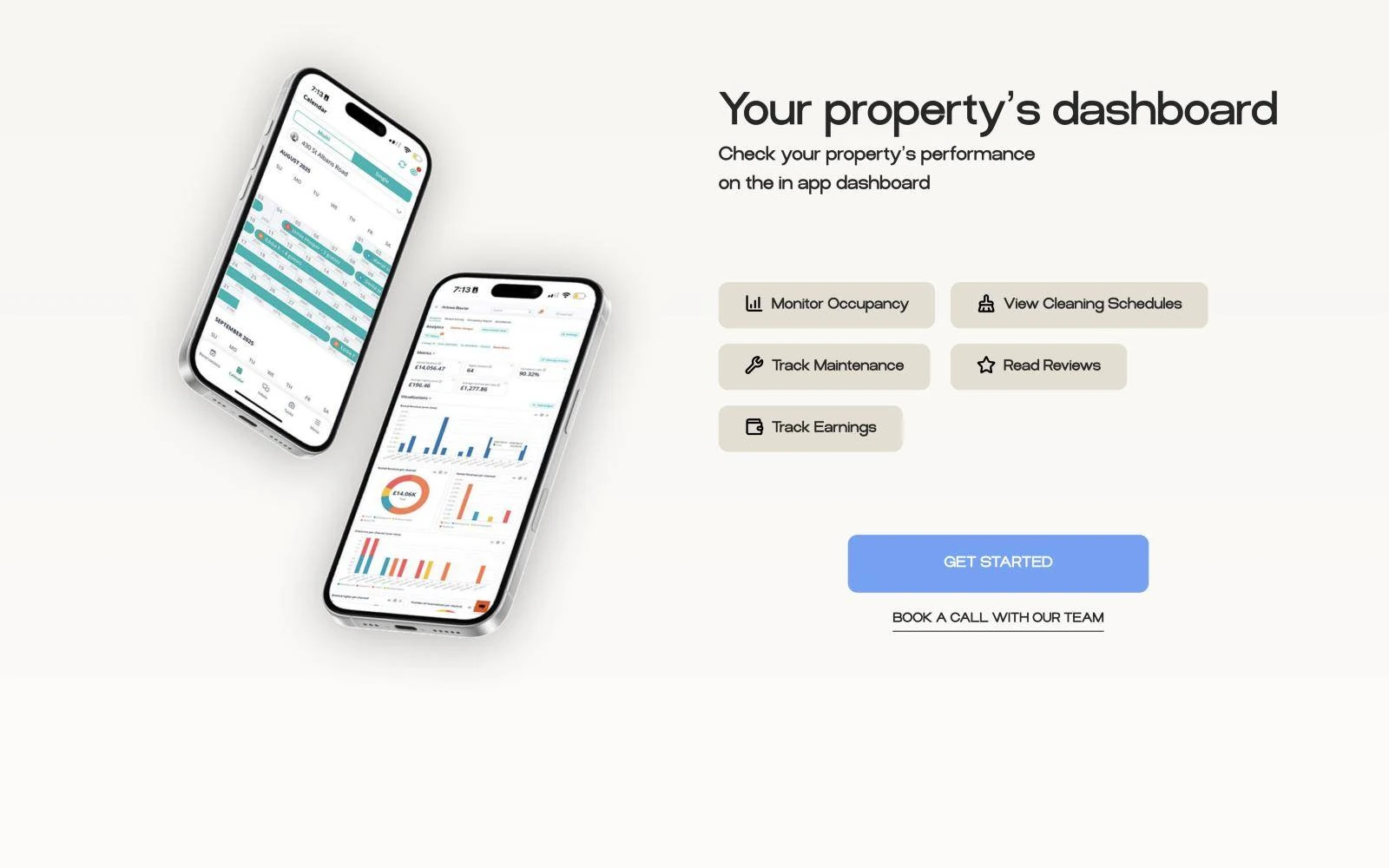
Process
Estimate, onboarding and live performance laid out as one calm path, so the next step is always obvious and every section ends with the same clear call to action.
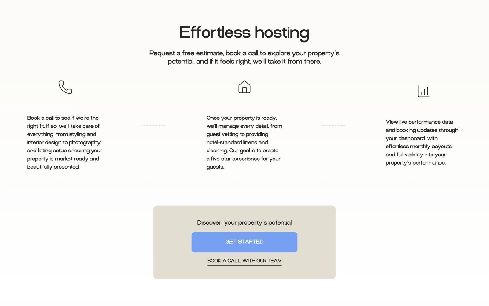
Look and feel
Soft stone and sage tones, generous photography and a friendly geometric typeface. It feels closer to an interior studio than a lettings agency, which is exactly the point for owners of nice homes.
Key decisions
On a contact page, linked from the footer.
Address and bedrooms in the hero, so the first click starts an estimate.
Keep them for the sales call.
Show the performance-based fee openly, right beside the services.
A bullet point that says "monthly reports".
Show the owner dashboard itself, with occupancy, cleaning and earnings at a glance.
A corporate lettings agency in blue.
An interior magazine: calm, warm and made for owners of nice homes.
The result
Your project next